THE LIGHTERHOUSE
BRAND GUIDELINES
A visual identity guide for The Lighterhouse — a boutique of vintage luxury lighters since 2020.
Contents
| 01 | Brand Overview |
| 02 | Logo & Mark |
| 03 | Colour Palette |
| 04 | Typography |
| 05 | Voice & Tone |
| 06 | Imagery & Photography |
| 07 | UI Components |
| 08 | Brand Values |
| 09 | Transactional Email |
01 — Brand Overview
Who We Are
The Lighterhouse is a boutique of vintage luxury lighters, founded in 2020 and based in Delft, The Netherlands. We offer a vast and always-changing collection of the most exquisite lighters. From historic relics to precious metals.
We are pleased to help you find your next treasure. We are not authorized sellers of any brands listed on our site; we sell vintage and pre-owned objects only.
Brand Positioning
- Category: Luxury vintage collectibles / niche e-commerce
- Positioning: Curated, rare, and precious — the world’s finest vintage lighters
- Audience: Collectors, connoisseurs, gift-buyers, and luxury enthusiasts
- Tone: Refined, understated, knowledgeable, with a warm personal touch
- Founded: 2020 · Based in Delft, The Netherlands
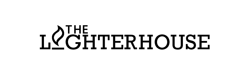
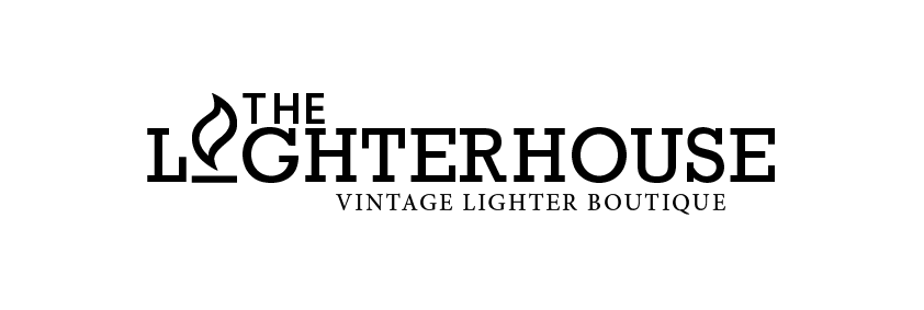
02 — Logo & Mark
Our Logo


Logo Usage Guidelines
- Always maintain clear space equal to the height of the lighthouse mark around the logo
- Never stretch, rotate, recolour, or add effects to the logo
- Use the white version on dark or navy backgrounds
- Use the navy version on white or light backgrounds
- Minimum size: 120px wide for digital, 30mm for print
03 — Colour Palette
Brand Colours
Lighthouse Navy
#002E5D
Primary brand colour. Use on all main backgrounds, headers, and CTAs.
Flame Orange
#FE5000
Accent colour. Use for highlights, links, dividers, and hover states.
Pure White
#FFFFFF
Body backgrounds, text on dark surfaces, and negative space.
Charcoal
#252527
Body copy on light backgrounds.
Silver Mist
#F0F0F1
Section backgrounds, card fills, subtle separators.
04 — Typography
Type System
Display / Headings
Shippori Mincho B1
Aa Bb Cc Dd Ee Ff Gg Hh Ii Jj Kk Ll Mm Nn
| H1 | 56px · Bold 700 · Tracking 0 |
| H2 | 36px · Bold 700 · Tracking 0 |
| H3 | 24px · SemiBold 600 |
Body / UI
Shippori Mincho
All long-form text, navigation, labels, and captions.
| Body | 16–17px · Regular 400 · Line height 1.8 |
| Small | 13–14px · Regular 400 · Letter spacing +2px |
| Nav | 13px · Regular 400 · All-caps · Tracking +3px |
05 — Voice & Tone
How We Speak
The Lighterhouse voice is knowledgeable without being academic, warm without being casual. We speak to collectors as equals — sharing in the joy of a rare find, the weight of history in the hand.
Refined
Elegant prose, precise vocabulary. We describe objects with the care of a watchmaker. No slang, no hype.
Knowledgeable
We know lighters. From Dunhill to Cartier, from Zippo war editions to Tiffany sterling. Our expertise is quiet confidence.
Warm
We are pleased to help you find your next treasure. Personal, attentive, and genuinely delighted by every piece in our collection.
Playful (rarely)
“It probably got burned, you know how it goes with lighters.” — Wit is welcome, used sparingly, always in character.
Do & Don’t
Write like this
- ✓ “A remarkably preserved 1960s Dunhill Rollagas in sterling silver.”
- ✓ “We are pleased to welcome this piece to our collection.”
- ✓ “Each object arrives with care and discretion.”
Avoid this
- ✗ “AMAZING lighter! Don’t miss out!!”
- ✗ “Buy now before it’s gone 🔥🔥🔥”
- ✗ “Super rare find, grab it fast!”
06 — Imagery & Photography
Visual Style
Product Photography
- Clean white or neutral grey backgrounds
- Soft, directional studio lighting — no harsh shadows
- Multiple angles: top, side, detail shots of engravings and mechanisms
- Macro close-ups to highlight craftsmanship
- No filters or over-processing — true colour reproduction
Lifestyle / Editorial
- Muted, rich palettes — aged leather, marble, velvet
- Suggest context: a writing desk, a coat pocket, a fireplace
- Timeless, not trendy — could be 1960 or today
- No faces or people — the object is the hero
- Candlelight or golden-hour warmth welcome in editorial
What to Avoid
- Stock photos of people
- Bright, saturated or neon colours
- Heavy Instagram-style filters
- Cluttered or busy backgrounds
- Low-resolution or blurry images
07 — UI Components
Interface Elements
Buttons — Single Product Page
Both CTA buttons appear on the product detail page, stacked full-width below the price.
| Background | #FFFFFF (white fill) |
| Text colour | #000000 · uppercase · 14px · Shippori Mincho · weight 500 |
| Border | 1px solid #000000 · border-radius: 0 (sharp corners) |
| Padding | 20px top/bottom · 40px left/right |
| Width | Full width of product info column |
| Hover state | Background #000000 · text #FFFFFF |
Navigation Bar
Shippori Mincho · 13px · All-caps · Letter spacing +3px · Active/hover: #FE5000
Product Cards — Catalogue Grid
Cards are completely minimal — image only, then text below. No border, no card background, no button on the card. Clicking the image navigates to the product page.
DUNHILL ROLLAGAS LIGHTER
In Box // 1970s
€ 400,00
| Card container | No border · no background · no border-radius |
| Product title | Shippori Mincho · 15px · weight 500 · uppercase · #000000 · centred |
| Subinfo / era | Shippori Mincho · 14px · weight 200 (light) · #000000 · centred |
| Price (catalogue) | Shippori Mincho · 16px · weight 400 · #000000 · centred |
| Price (product page) | 30px · weight 200 · #FE5000 Flame Orange · centred |
| Grid layout | 3 columns on desktop |
09 — TRANSACTIONAL EMAIL
Transactional Email
1. Overview
All transactional emails follow a single master template. Every email sent to a customer — from order confirmation to password reset — must feel like it came from the same hand that curated the collection. Restrained, established, warm.
2. Structural Layout
The email is a single-column layout, maximum 620px wide, centered on a Silver Mist (#F0F0F1) background. It consists of five stacked blocks in this fixed order:
Header → Heading area → Body content → CTA button → Footer
There is no sidebar, no multi-column layout, and no background imagery. Whitespace is the primary design tool.
3. Colour Usage
| Role | Colour | Hex |
|---|---|---|
| Header background | Lighthouse Navy | #002E5D |
| Footer background | Lighthouse Navy | #002E5D |
| Email body background | Pure White | #FFFFFF |
| Outer wrapper background | Silver Mist | #F0F0F1 |
| Body text | Charcoal | #252527 |
| Section labels, date, single divider | Flame Orange | #FE5000 |
| Active roadmap circles | Lighthouse Navy | #002E5D |
| Inactive roadmap circles | Light grey border | #C8C8C8 |
| Inactive roadmap labels | Muted grey | #AAAAAA |
| Footer secondary text | Blue-grey | #8899AA |
| Total price | Charcoal | #252527 |
4. Typography
All email type uses a single serif stack: Georgia, ‘Times New Roman’, serif. Shippori Mincho (the web font) is not used in email due to client rendering limitations. Georgia is the approved fallback and carries the same editorial character.
| Element | Size | Weight | Colour | Tracking | Transform |
|---|---|---|---|---|---|
| Date line | 10px | Normal | #FE5000 | 4px | Uppercase |
| Order heading | 24px | Normal | #252527 | 4px | Uppercase |
| Body copy | 16px | Normal | #252527 | 0 | None |
| Section labels | 10px | Normal | #FE5000 | 3px | Uppercase |
| Order table — label | 11px | Normal | #999999 | 1px | Uppercase |
| Order table — value | 13px | Normal | #252527 | 0 | None |
| Total amount | 15px | Bold | #252527 | 0 | None |
| CTA button text | 11px | Normal | #252527 | 2px | Uppercase |
| Roadmap labels | 11px | Normal | Active #002E5D / Inactive #AAAAAA | 1.5px | Uppercase |
| Footer body text | 11px | Normal | #8899AA | 0 | None |
| Footer social links | 9px | Normal | #8899AA | 2px | Uppercase |
| Copyright line | 10px | Normal | #8899AA | 0 | None |
5. Header
The header is a tightly padded navy band. Padding: 16px top, 32px sides, 14px bottom. It should feel like a letterhead band, not a hero image.
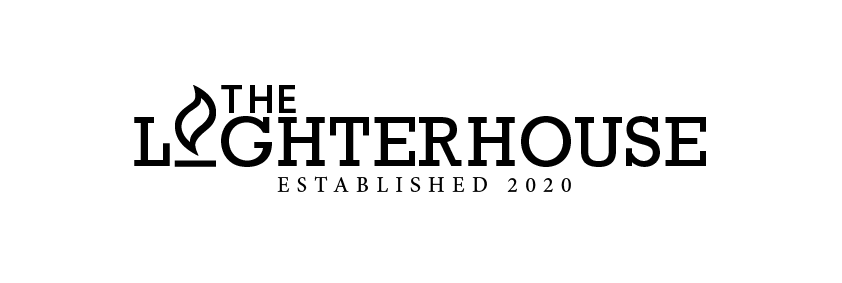
Logo used: Logo-2026-wit-DEF-established-oranje.png (white wordmark with orange flame, “ESTABLISHED 2020” subtitle built in). Width: 520px / 100% fluid. No additional “Since 2020” text. There is no decorative divider below the header — the orange rule was removed from this position to reduce orange repetition.
6. The Orange Divider — Rule of One
Orange horizontal rules (#FE5000, 40px wide, 1px height) appear exactly once per email: directly beneath the main order heading (ORDER RECEIVED, ON ITS WAY, etc.). This is the only decorative rule in the email body. All other dividers have been removed. The restraint is intentional — the single mark carries meaning precisely because it is the only one.
7. Order Status Roadmap
The roadmap shows four steps in a single horizontal row: Received · Processing · Dispatched · Delivered. Each step consists of a circle with a checkmark and a label below.
Active step (completed): Navy filled circle (#002E5D), white checkmark (#FFFFFF), navy label (#002E5D). Connector line to next step: navy, 1px.
Inactive step (pending): White circle with light grey border (#C8C8C8), grey checkmark (#C8C8C8), muted grey label (#AAAAAA). Connector line: grey, 1px.
The roadmap block links to https://thelighterhouse.com/my-account/orders/
| Received | Processing | Dispatched | Delivered | |
|---|---|---|---|---|
| Processing order | ✓ | ✓ | — | — |
| Completed order | ✓ | ✓ | ✓ | — |
| On hold | ✓ | — | — | — |
| Cancelled / Failed | No roadmap | |||
| Refunded | No roadmap | |||
| Password reset / New account | No roadmap | |||
8. Order Details Table
A clean two-column table. No quantity column — customers purchase one lighter per order. Rows: Order Number, Date, Product name + price, Shipping (if applicable), Total. Row separators: 1px Silver Mist (#F0F0F1). The label column is small, uppercase, muted grey. The value column is 13px charcoal, right-aligned. Total row is 15px bold charcoal, no separator above it.
9. Product Image
For all order emails, the first product image from the order is pulled at large size and displayed full-width (100%) directly below the ORDER RECEIVED heading, above the salutation. This gives immediate visual confirmation of what was purchased — the single most reassuring element in a luxury transaction email. No caption, no border, no styling. Just the image, full width.
10. CTA Button
Ghost/outline style. No filled background. The button uses a 1px solid charcoal border (#252527), white background, charcoal text. This matches the brand guidelines button style precisely.
Padding: 16px top/bottom, 52px left/right. Text: 11px, letter-spacing 2px, uppercase serif. The button is centered and links to the customer’s account orders page. Label: “View My Account”.
11. Additional Content Block
Separated from the main body by a 1px Silver Mist rule. Text is 13px, line-height 1.9, colour #888888. This area is managed through WooCommerce email settings and contains:
If you have any questions in the meantime, we are always happy to hear from you at contact@thelighterhouse.com.
With warm regards, The Lighterhouse
No “· Delft” in the sign-off. No dashes anywhere in email copy.
12. Footer
Navy background (#002E5D), padding 32px top, 40px sides, 28px bottom. Structure (top to bottom):
- White logo
Logo-2026-wit-DEF.png— 180px wide / 45% fluid - Social links: Instagram · Facebook — 9px uppercase, muted blue-grey, orange dot separator
- Website link in Flame Orange + contact email in blue-grey, same line
- Copyright: © [year] The Lighterhouse. All rights reserved.
No “Vintage Lighter Boutique · Delft, The Netherlands” line — removed for simplicity. The footer is not informational; it is a brand seal.
Social: instagram.com/thelighterhouse · facebook.com/TheLighterhouseOfficial
13. Reply-To
All WooCommerce transactional emails have a global Reply-To filter set in functions.php:
Reply-To: The Lighterhouse <contact@thelighterhouse.com>
14. Voice & Copy Rules
- No dashes (-) anywhere in email body text
- Salutation: “Dear [First name],” — never “Hi” or “Hello”
- Sign-off: “With warm regards, / The Lighterhouse”
- Tone: refined, warm, knowledgeable — not urgent, not promotional
- Speak to the customer as a fellow appreciator of quality
- Never use exclamation marks, emojis, or urgency language
15. Mobile Responsiveness
At viewport widths below 620px, a @media block applies: header padding reduces to 18px/20px, logo scales to 80% / max 300px, all body padding reduces to 24px sides, roadmap circles reduce to 30px, roadmap labels reduce to 9px, CTA button padding reduces to 15px/32px, footer logo reduces to 50% / max 160px.
16. Asset Reference
| Asset | Path |
|---|---|
| Header logo (established, white/orange) | wp-content/uploads/2026/05/Logo-2026-wit-DEF-established-oranje.png |
| Footer logo (white only) | wp-content/uploads/2026/05/Logo-2026-wit-DEF.png |
| Template path | wp-content/themes/the-lighterhouse-theme/woocommerce/emails/ |
Brand book reference · May 2026
08 — Brand Values
What We Stand For
🔍
Curation
Every piece is hand-selected. Quality over quantity. Only items we would treasure ourselves enter our collection.
🏛️
Heritage
We celebrate the craftsmanship of great makers. Each lighter carries a story — a decade, a maker’s mark, a life lived.
🤝
Trust
Transparent about condition, provenance, and price. We are not authorised resellers — we deal in honest vintage trade.
✨
Delight
The joy of discovery. Finding the perfect piece for the right person is what drives us. The treasure hunt never ends.
THE LIGHTERHOUSE
Brand Guidelines — Internal Use Only
© The Lighterhouse · Delft, The Netherlands · thelighterhouse.com
This document is confidential and intended for internal and partner use only.